
Creating a Brand Identity for a Start-Up Non-Profit: A Case Study
Recently, a new non-profit organization contacted me to develop their visual identity from the ground up. Their mission is powerful: to eliminate financial barriers that prevent neurodivergent individuals with speech and language differences from accessing Augmentative and Alternative Communication (AAC) devices.
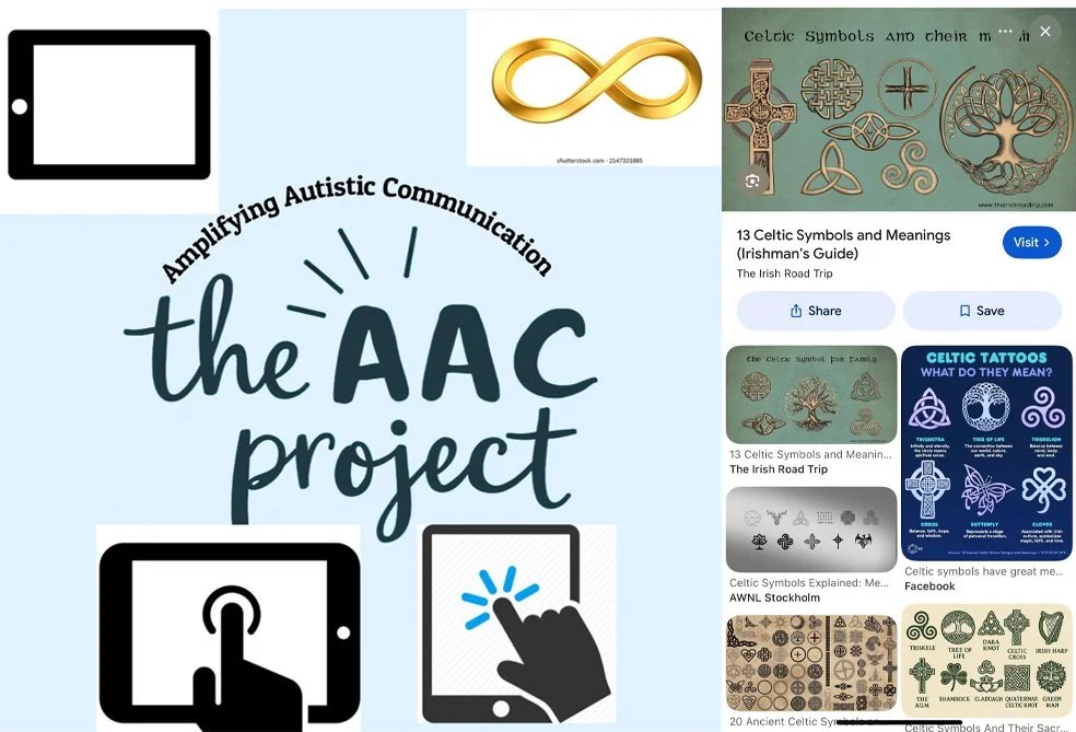
The first step in a logo project is to ask the client to share their vision and preferences. Request specifics such as desired symbols, color palettes, type (font) preferences, and any logos they admire — even from other industries. I also ask for logos from similar organizations or competitors so we can avoid producing anything too similar. Above is what I was provided along with links to other organizations in other cities doing similar work.
Understanding the Mission
AAC devices—typically iPads or specialized tablets with communication software—give voice to those who are non-verbal or have unreliable speech. This includes children with developmental disabilities such as autism, adults who've lost speech due to injury or disease, and anyone whose speech is difficult to understand. These devices are life-changing, yet systemic and financial barriers often put them out of reach for families who need them most.
Beyond providing devices, this organization also offers training for users, caregivers, therapists, educators, and support staff—ensuring that each device becomes a true tool for expression and connection.
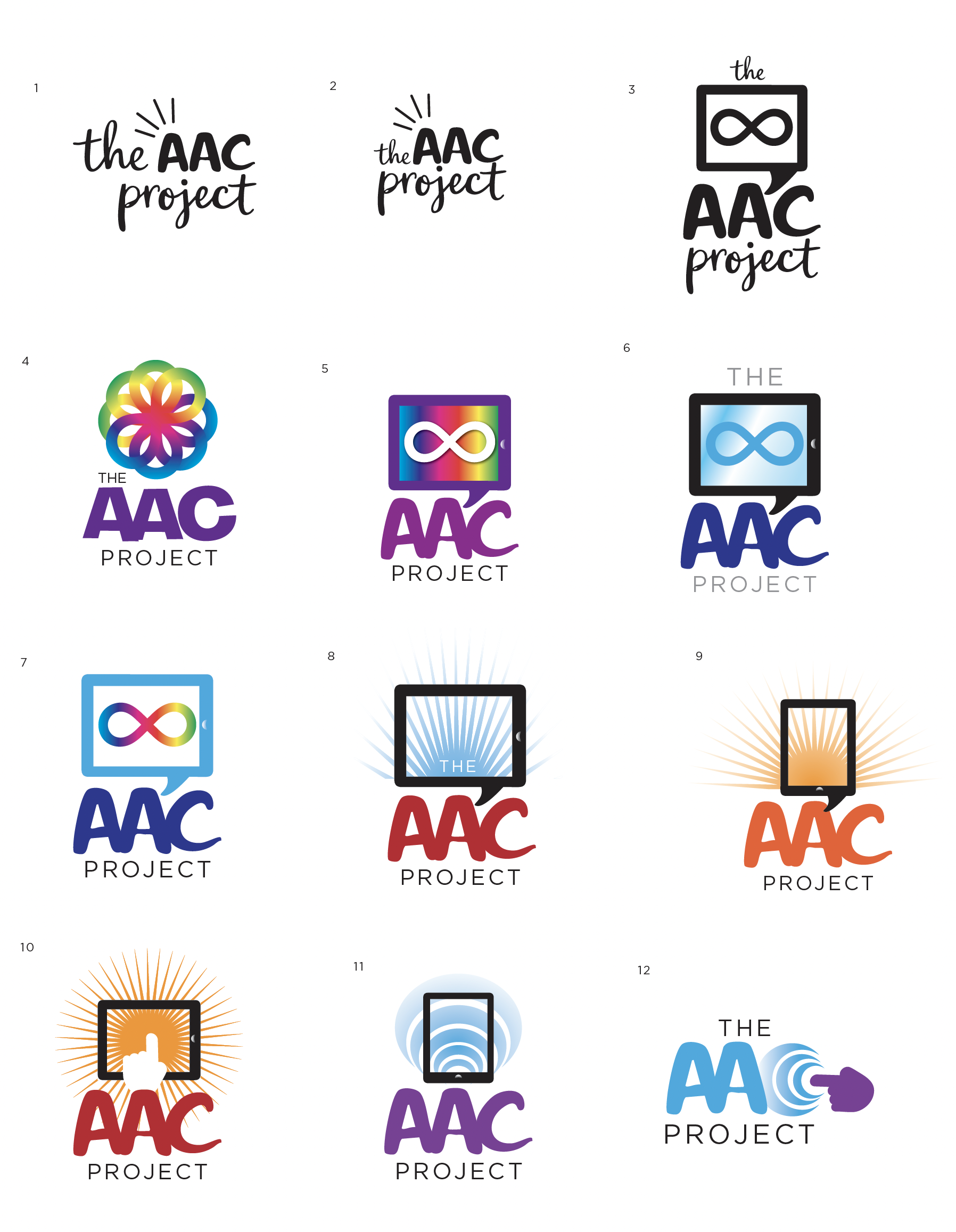
Over the following seven to eight business days I developed design options. I had planned to deliver 3-5 concepts, but I kept exploring and ultimately produced the 12 options shown above. My process began by tidying and refining the original mark, then expanded to experiment with different symbols, color palettes, and other visual elements to better communicate the organization’s purpose.
The Design Process
When starting a non-profit from scratch, strategic planning is essential. I begin by mapping out the complete marketing ecosystem needed to launch successfully. For this project, the priorities were clear. These foundational elements must be completed before other marketing materials can be developed effectively.
Logo/Branding
I would present an initial 3-5 graphics from the ideas you provided for you to choose one that you’d like to have refined with all revisions included.
I would provide you with the logo artwork in different lock-ups (often logos are used stacked, centered, flush left, or in one line).
I would provide these in a variety of file types for your internal and external use. Different vendors will require different file types to reproduce a logo accurately.
Website
I would require all text and images before the site begins. (Or as much as can be gathered.)
I would set up the site in Squarespace. It has a decent user interface that, with a few minutes of training, you’d be able to go in and make (non-major!) revisions without having to do them through me each time.
I will need a web domain name to use, which can be arranged through Squarespace. AACProject.org is available. (About $20/yr, not included in design estimate)
At the point at which it’s ready to launch, I would need a credit card to pay for the website hosting through Squarespace. (Recommend Squarespace “GET STARTED” package at $192 annually, not included in design estimate.) After payment, the site would be turned over to your ownership. I would still have access to it.
Website pages (I assume the below, you may need less depending on how much content you’ll have at the start. More can be added later)
HOME
ABOUT US
OUR MISSION/WHAT WE DO
DONATE
SUCCESS STORIES/IMPACT
GET INVOLVED
CONTACT
Narrowing down the options clarified the purpose of the logo and what it was intended to convey.
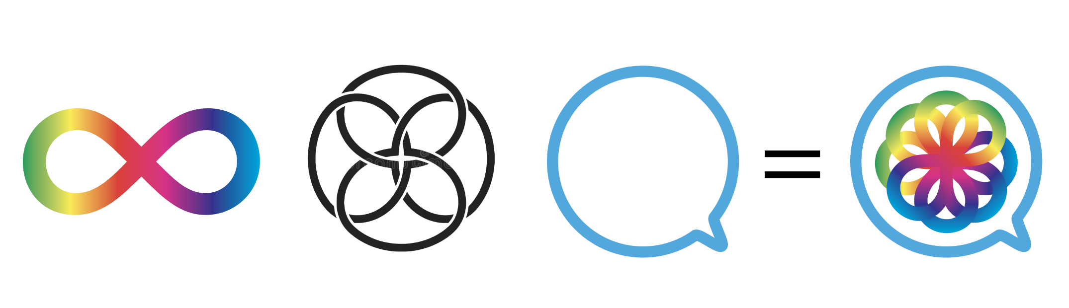
The rainbow infinity symbol commonly represents neurodiversity, especially autism. Inspired by the client’s Celtic knot reference and a speech bubble, we created a single symbol that integrates all three elements: the rainbow infinity loop (neurodiversity), Celtic-knot interlacing (unity), and a speech-bubble shape (communication). This unified mark communicates identity, connection, and voice in a single, recognizably inclusive emblem.
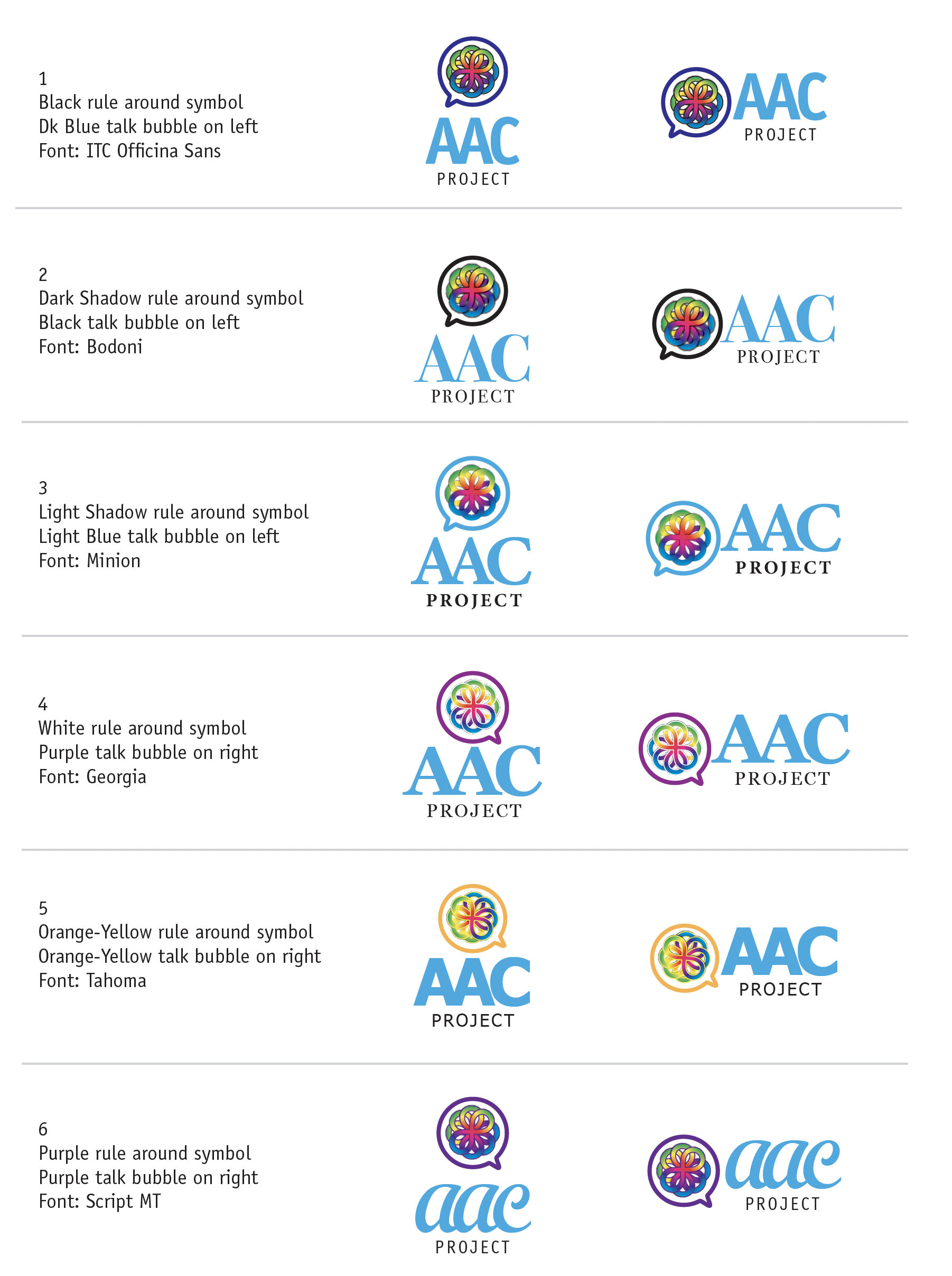
With guidance on the symbol, we developed multiple options exploring typeface choices, color palettes, and treatments to ensure the infinity symbol remains clear and legible at different sizes. Two logo lock-ups were created—horizontal and stacked—so you can choose the configuration that best fits a given application when media size or shape impose constraints.
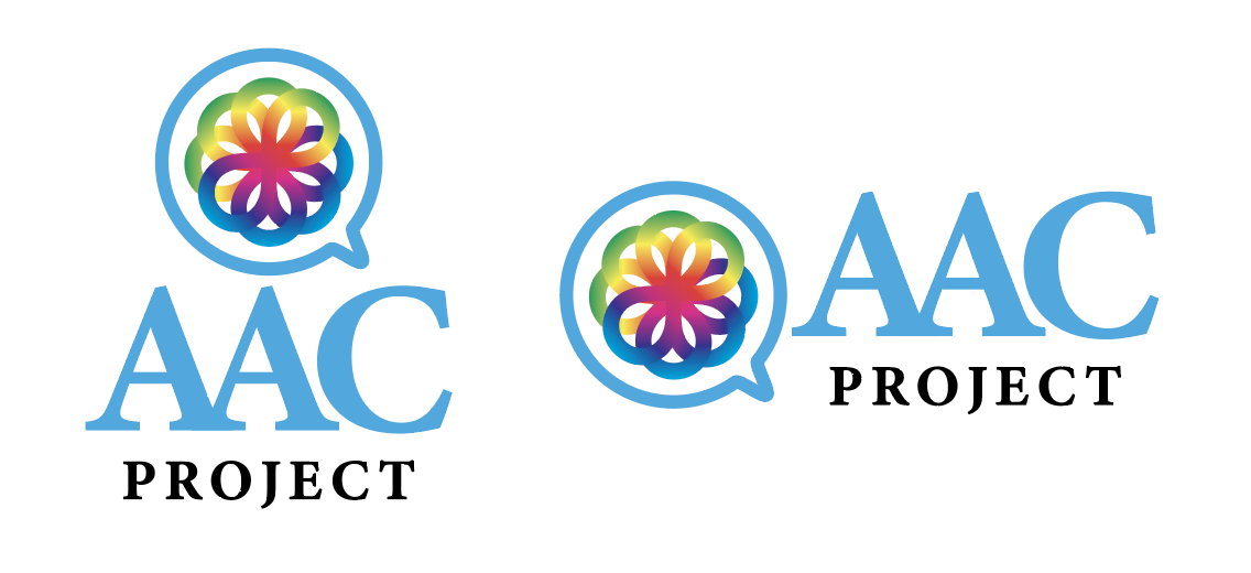
Here is the final logo artwork. Additional versions included use of a tagline. All files were supplied in multiple formats because different media—from signage to online—require different file types.
AACProject.org
The AACProject.org website and the logo were developed concurrently; the finalized logo artwork was added at the end of the site’s build.
The site’s primary purpose is to explain the organization’s mission and services. Its primary call to action is to donate; a secondary call to action is to recruit volunteers — advisors, board members, event support — and to connect with other organizations for networking. The site also lists local resources for families of people with non‑verbal neurodivergent conditions.
The most compelling element, to me, is the homepage video. It features Brayden, the teenage son of AAC Project founder Michael, who is non‑verbal and autistic. In the video, Brayden uses his AAC device to communicate a familiar teen request—asking for more Taylor Swift—illustrating how AAC technology enables everyday self-expression.
You can visit their Facebook page here.
Other Graphic Elements
Other branding materials could include a comprehensive style/branding guide, branded templates, and a suite of supporting graphics such as repeatable patterns, textures, background treatments, and other visual motifs.
While these elements can add consistency and flexibility across future applications, they were not included in the scope of this project.
Next Steps
In addition to the logo and website, an organization may also want to consider supporting materials that establish your brand and strengthen your outreach. These may be “Phase 2” projects to consider once the logo and website are finished. These might include:
Social media profile graphics and post templates
Email newsletter design or template
Business cards and/or digital stationery
Presentation or fundraising slide deck template
Branded one-page overview or donation flyer
These assets can help ensure your nonprofit presents a consistent, professional look across all platforms as you begin promoting your mission.
Timeline Expectations
Creating a comprehensive brand identity isn't a quick process. From initial consultation through final delivery, expect a minimum of one month for logo and website development. This timeline allows for:
Discovery and research
Concept development
Revision rounds
Finalization and file preparation
Ready to Start Your Project?
Whether you're launching a non-profit or need to refresh your organization's brand, I'd love to help tell your story visually. Contact me to discuss your project, timeline, and pricing. Call (716) 884-3274 or email me here.