
Logo Design Case Study: The Jewish Museum of Buffalo
The Project
When the Jewish Museum of Buffalo prepared to open in a new home inside Buffalo’s Temple Beth Zion, I was asked to design its logo. The identity needed to do three things:
Unify the museum’s two established programs under one identity: the Cofeld Collection and The Blum Jewish Education Project
Work across signage and other applications
Feel both historic and contemporary
The Setting
Temple Beth Zion was founded in 1850. Its current home on Delaware Avenue was designed by architect Max Abramovitz of Harrison & Abramovitz and built from 1964 to 1967. It is one of Buffalo’s most architecturally significant buildings, and its stained-glass windows are arguably some of the finest anywhere.
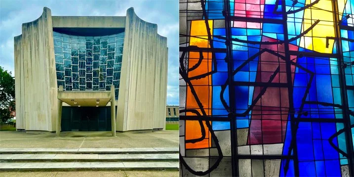
The windows have a special meaning for me as a designer. They were created by Ben Shahn (1898-1969), a New York City graphic designer often considered one of the first advertising “art directors.” He designed print advertising and promotional campaigns for CBS and illustrated for magazines like Harper’s, Time, Vogue, and Esquire. He was also a muralist and fine artist. Working with imagery from a founding graphic designer’s windows was a privilege.
The Starting Point: Two Existing Identities.
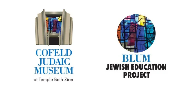
I had already designed logos for both programs that would live under the museum’s roof.
The Cofeld Collection (formerly the Cofeld Judaic Museum of Temple Beth Zion) holds objects including a large coin collection, Holocaust-related items, historical objects connected to Western New York, and Judaica such as menorahs, seder plates, and yads. It also holds X-ray crystallographer Herbert Hauptman’s Nobel Prize in Chemistry.
The Blum Jewish Education Project offers workshops, talks, and tours for interfaith and community groups and students, building understanding of local history, architecture, and Jewish heritage.
The colors and fonts from both logos carried over into the new identity. That gave the new mark a visual lineage and made it feel like a natural next step rather than a restart.
The Constraint: No Building.
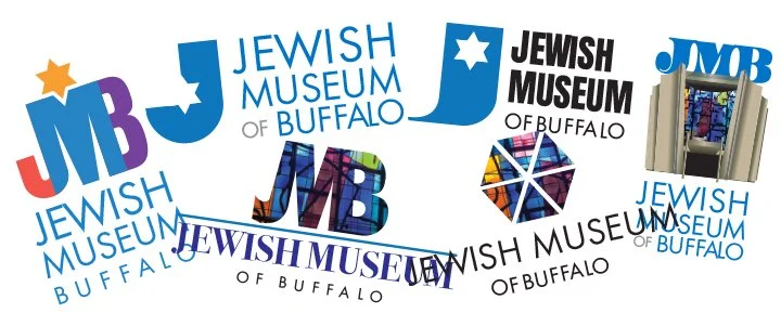
The museum asked me not to feature the Temple’s architecture—after a first round of logos that incorporated the building graphic. I believe clients have to actually see things in front of them to figure out what they don’t want.
The building is so closely tied to the congregation that using it would blur the museum’s separate identity. That was a challenge, because the building is so distinctive and an easy visual shortcut. Leaving it out was the right call. It pushed me to find another way to tie the mark to this place.
They suggested trying options using the initials JMB.
The Process:
I developed about a dozen concepts, drawing on familiar Judaic imagery like the Star of David, Hebrew calligraphy, and the color blue. After three to four rounds of revisions, we arrived at the final mark.
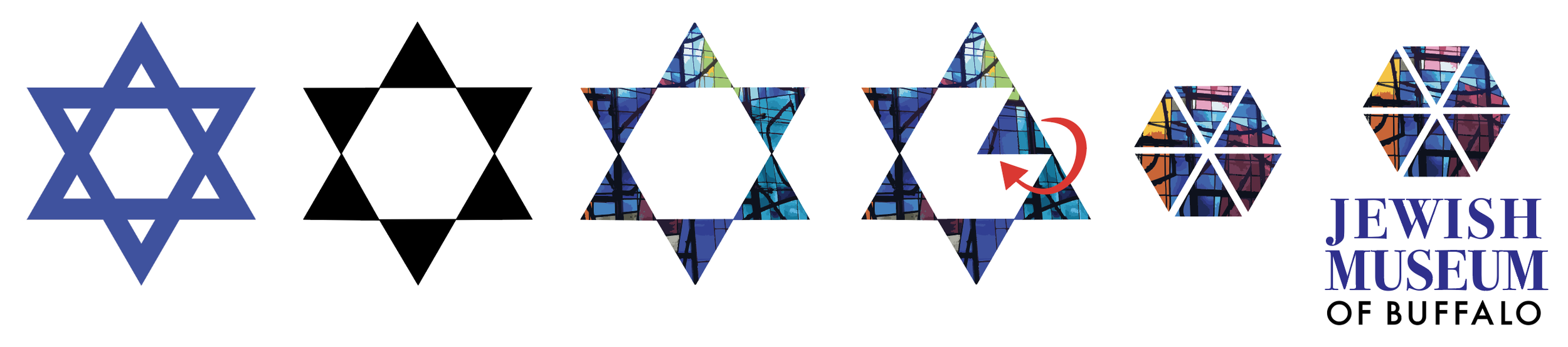
One concept was a Star of David with a detail of the stained glass inside it. It was a solid start, but too “on the nose.” It was the kind of idea a first-year design student might propose, and a logo for an institution with this much history needed to stand out from the pedestrian.
The breakthrough came from thinking about what a museum like this does. It looks inward, at its own history and at generations of Buffalo Jewish culture. So I made the logo do the same.
The Final Logo
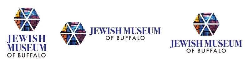
I took the six triangles that form the points of a Star of David and flipped each one so its point faces inward. The result is a hexagon with a detail of the Temple’s stained-glass windows in each of the six triangles. The mark still reads as a star, but it turns toward its center instead of radiating outward. The windows bring in the building’s art without showing the building itself.
What the Museum Received
The museum received a complete set of logo files:
A primary logo
Horizontal and stacked versions
Files in multiple formats for online, print, signage, and displays
Timeline:
The project started in September 2025 and ended with final logo delivery in November 2025. Building on logos I had already created for the two programs made the process efficient. The museum’s team was wonderful to work with and made the project a breeze.
Thinking About a Logo Project? How to Prepare
If you’re considering a logo or identity project, a little preparation makes the first conversation much more productive. Here’s what I’d ask you to bring:
A list of nouns. Make a list of things that exist in the world, such as objects, places, plants, tools, or animals, rather than concepts or verbs. Concrete nouns give me real graphic references to work with and help narrow the possibilities quickly.
A budget in mind. Knowing your range up front helps me shape the scope of the project.
Your competitors’ logos. Show me what similar organizations in your field are using. The goal is a mark that stands out in your marketplace, not one that blends in.
Your timeline. Tell me when you need the finished logo, and any events or launches it needs to be ready for.
How it will be used. Signage, packaging, web, merchandise, vehicles, and uniforms all have different requirements, and knowing the uses early keeps the design flexible where you need it.
Let’s Talk.
Have a project in mind, or just want to explore whether we’d be a good fit? Send me an email at info@jcharlier.com.